RESEARCH: Film Magazine Covers
 This is a film magazine cover featuring Hugh Jackman as Wolverine. I really liked this cover because of the contrast between the light blue to the dark blue sky against the red of the magazine title. Another thing that I found interesting was the fact that Hugh Jackman is wearing a white vest in this picture and all of the writing about the film is in white as well. Hugh Jackman has been placed over the text, making him the most important thing on the cover. With him standing in front of all of the text, it also supports the idea that his character has a lot of power and strength. They have used the same font throughout the cover (except in the title) which makes the cover seem more professional and clean whereas some magazine covers I have seen look busy and messy due to using loads of different fonts which just looks unprofessional. You can tell that the genre of the film is probably an action film because there are no really bright colours and Hugh Jackman’s character is looking very serious and maybe concerned about something. Another thing that makes this magazine cover look professional is the fact that all of the text has been placed around him. This again makes him seem like the most important thing on the page.
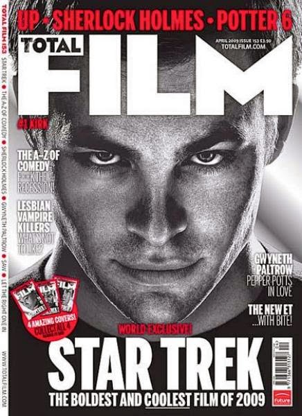
 This magazine cover features Chris Pine playing Kirk from the film the Star Trek. His portrait is in black and white and all of the text around the cover is in white or red. I really like this colour scheme because it makes everything stand out. The editing that has been done on the portrait of Chris Pine has emphasised certain features about him e.g. his cheekbone and jawline. Not only has this been done to make him seem more attractive, but to also make the photo darker which will contrast against the white and red writing around the picture. He is looking very serious again, as if he were planning something. I am noticing a trend in film magazine covers that all of the actors are: 1) modelling as their character and 2) they are rarely ever looking happy. This may be because of the genre but in most genres (excluding romantic comedies or comedies) all actors are looking stern, concentrated and powerful. I liked this film poster because it’s very simple, not overcrowded and it’s not giving too much information away about the film or what is included in the magazine itself. I find that the more information a magazine gives about the content of the magazine, the more likely I won’t pick it up because I can tell just by looking at the cover whether I’m interested or not. If I saw this film magazine in a shop, I would most likely pick it up and flick through and be more likely to buy it. They haven’t changed their fonts which makes the magazine seem a lot more professional because it doesn’t look messy and it doesn’t look like they’ve only put five minutes effort into it.
 This film magazine cover is a lot different to some of the others I have seen. The colour scheme is mainly based around yellows, reds and white but Jenifer Lawrence (who is playing the role of Katniss Everdeen) is wearing black and the contrast between the fire and her black outfit is very dramatic. This magazine cover is a lot brighter than some of the others I’ve seen but at the same time because of the fire and the white and yellow writing. This cover is also very crowded. It seems to be a lot more about gossiping and less about the films themselves. For example, in the bottom left hand corner, there is some text which says “Christina Ricci on sex with R-Pattz”. This obviously didn’t happen but Christina Ricci and Robert Patterson must be in a film together sometime soon which involved a sex scene. By writing this, it attracts all of the people who find Robert Patterson attractive because they want to find out more and in the process, find out about the film.

No comments:
Post a Comment