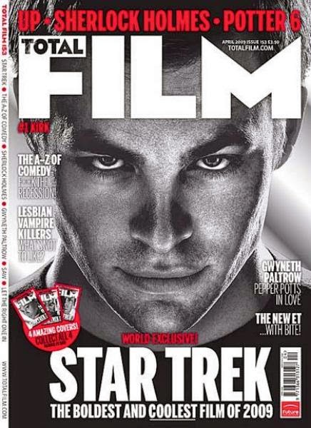
Film posters have to be consistent in order for them to be effective. By consistent, I mean consistent in terms of font, layout, colour palette etc. If it's all jumbled up and different, it won't look as effective, clean and professional which may lead to a lack of positive promotion for the film.

This is the film poster for the romantic-comedy film called "Don Jon". It was written and directed by Joseph Gordon-Levitt and he also plays the lead character; Jon. It follows the story of Jon who is obsessed with porn and having sex with women until he finds someone who he thinks is "the one". The only thing she asks is that he gives up watching porn. I wont go into the spoilers but it is a very good film, it's edgy and definitely doesn't have a predictable ending which I like. In terms of this film poster, this is a perfect example of how making sure a poster is clean and organised can make everything seem more professional. All of the writing is in the same font. It may be in different sizes but the same font helps make it seem more professional and not jumbled up. The colour scheme of the red and white have connotations which can relate to the film. The red could relate to the passion that he has for his body, his house, his family, his church, his women and his porn but it could also relate to love and sex etc. The white could represent the woman who he falls for who is very innocent and won't have sex with him until she meets his family etc. She doesn't want to rush things or disrespect her own self so the white writing may represent her. The layout is very organised which makes the poster seem more professional and makes it easy to read as well. This poster also doesn't feature (other than his t-shirt) any dark colours or dark backgrounds which definitely suggests that this isn't a horror film or a thriller/action film as dark colours are mostly associated with this.

However, this is one of the many film posters for The Human Centipede. When this film was released, it blew up. It had a generally negative reception due to the extremely repulsive plot but, as we all know, humans have a morbid curiosity so as more and more people were talking about how disgusting this film was, the more people watched it. In fact, there are rumours that at the auditions for the film, many people turned up but as the plot was explained and the script was read out, people passed out, threw up and had to leave because of the sheer gore of it, leaving only a few people left. This film poster really helps set the genre, target audience and plot of the film. The use of the deep, blood red in the background helps suggest that this is a horror film along with the blood splashed over the three "people" the centre character seems to be holding. You cannot see the mans eyes which is a key technique people use to take away their identity and more or less their humanity. In Phillip Zimbardo's "Stanford Prison Experiment", he made all of the guards wear sunglasses just like the character on this film poster. By doing this, it made them seem less human to the prisoners and made them seem more tough. Most emotion can be shown through the eyes so this study helps back up the possible reason this character is wearing sunglasses; to take away his identity and make him seem less human. It also takes away any possible emotion he may be feeling so only he can feel it. Another thing that makes this seem like a horror film poster is the fact he is holding what seems to be three people who are attached together (which is the whole plot of The Human Centipede" as well so this is how the plot is shown). There are no bright, happy colours in this film poster which suggests it can't be a comedy or a drama etc. The word "human" is written in the same colour, roughly speaking, as the man's skin on the poster. This could help imply the idea that this one human is putting other humans through awful torture but the audience may not consider him as human? They may see him more of a monster. The audience is clearly for adults and definitely not children. The title is the main indicator of this... how could you make The Human Centipede into a children friendly title? Probably couldn't. Also, with all the blood on the poster, it's definitely not going to be suitable for children.
In June 2011, the British Board of Film Classification (BBFC) refused to classify the sequel to The Human Centipede, The Human Centipede 2, for a direct-to-video release, meaning that it was banned completely on any format in the UK. The BBFC said the film was "undoubtably tasteless and disgusting" and was "sexually violent and potentially obscene". In October of 2011, after making 32 compulsory cuts to the film totalling 2 minutes and 37 seconds, the BBFC granted the film an 18 certificate. It was also banned in Australia until compulsory cuts were made. However, it is still banned in New Zealand today. In America, the film had it's premiere at the Fantastic Fest in Austen, Texas. The film's distributor, IFC Films, handed out complimentary sick bags to everyone at the screening and also put an ambulance outside the cinema for added effect, however one viewer was so violently ill whilst watching the unedited film that paramedics had to assist her. The fact that this sequel was banned in countries, still is banned and has such a reputation about it also helps with the promotion and marketing of the film. If the film has this much negative reviews, people are going to want to watch to see if they get scared as easily.
Film posters have to make sure they are being very clear when trying to put across their target audience, genre and plot in their film posters. If they aren't clear, it may lead to audience members going to view a film, thinking it's going to be a comedy for example and it may be a horror film. This rarely happens as production companies are very good at making posters very clear but sometimes you may get a film poster which isn't very clear.
 This is a film magazine cover featuring Hugh Jackman as Wolverine. I really liked this cover because of the contrast between the light blue to the dark blue sky against the red of the magazine title. Another thing that I found interesting was the fact that Hugh Jackman is wearing a white vest in this picture and all of the writing about the film is in white as well. Hugh Jackman has been placed over the text, making him the most important thing on the cover. With him standing in front of all of the text, it also supports the idea that his character has a lot of power and strength. They have used the same font throughout the cover (except in the title) which makes the cover seem more professional and clean whereas some magazine covers I have seen look busy and messy due to using loads of different fonts which just looks unprofessional. You can tell that the genre of the film is probably an action film because there are no really bright colours and Hugh Jackman’s character is looking very serious and maybe concerned about something. Another thing that makes this magazine cover look professional is the fact that all of the text has been placed around him. This again makes him seem like the most important thing on the page.